I collaborated with Moment to design an immersive booking experience for their travel site.
OVERVIEW
BACKGROUND
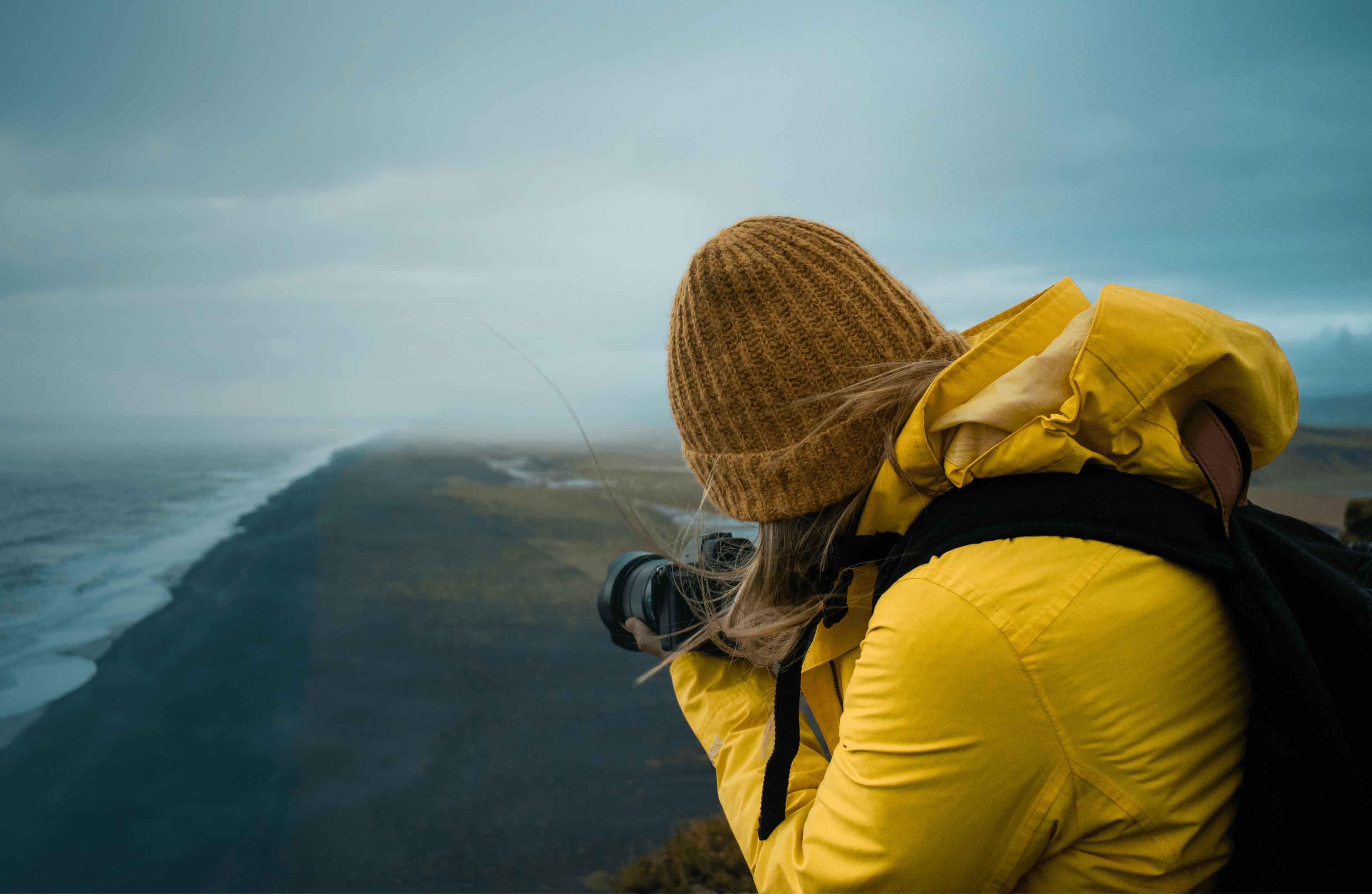
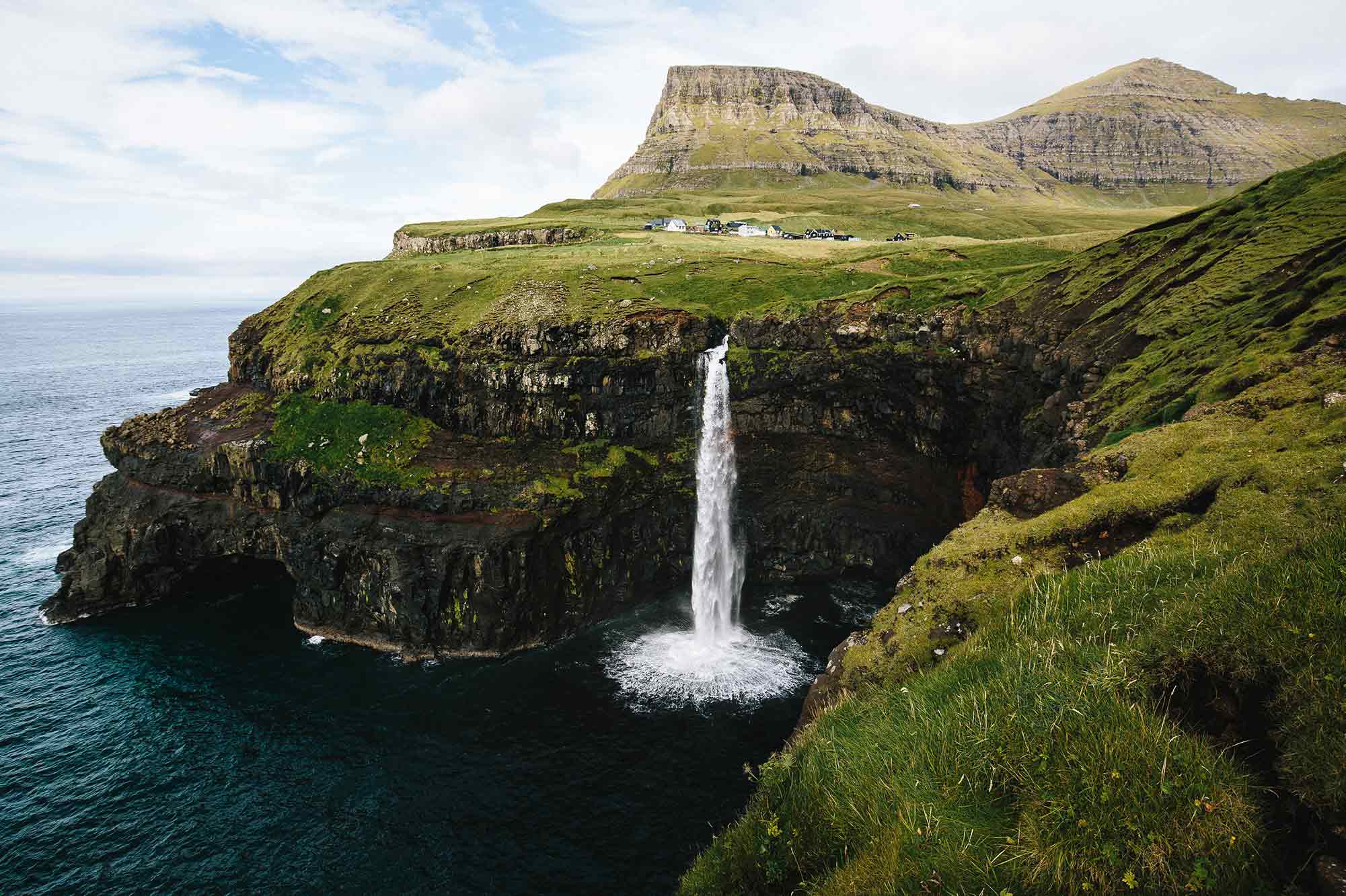
Moment is the market leader when it comes to camera lenses for mobile phones but they were expanding their business model to include travel. They aimed to create a way for users to book trips with talented photographers as their guide.
The team at Moment and I got together to explore ways to enhance their travel site. They wanted to improve the visual design, make the UX for booking trips more intuitive, and allow the itinerary to really stand out on the page.
BEFORE WE BEGIN
An important skill for any freelance designer is to know how to scope out a project and the ability to keep within the scope. I kicked off this collaboration by flushing out what their specific needs were and estimating my time to find a solution. We regrouped over a Zoom call and once everyone was aligned, we began the fun stuff: design exploration.
PHASE ONE
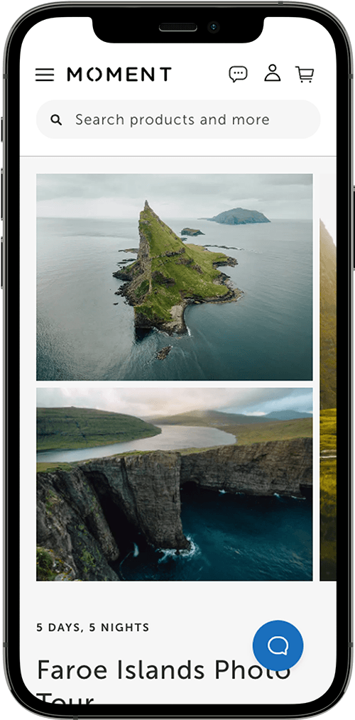
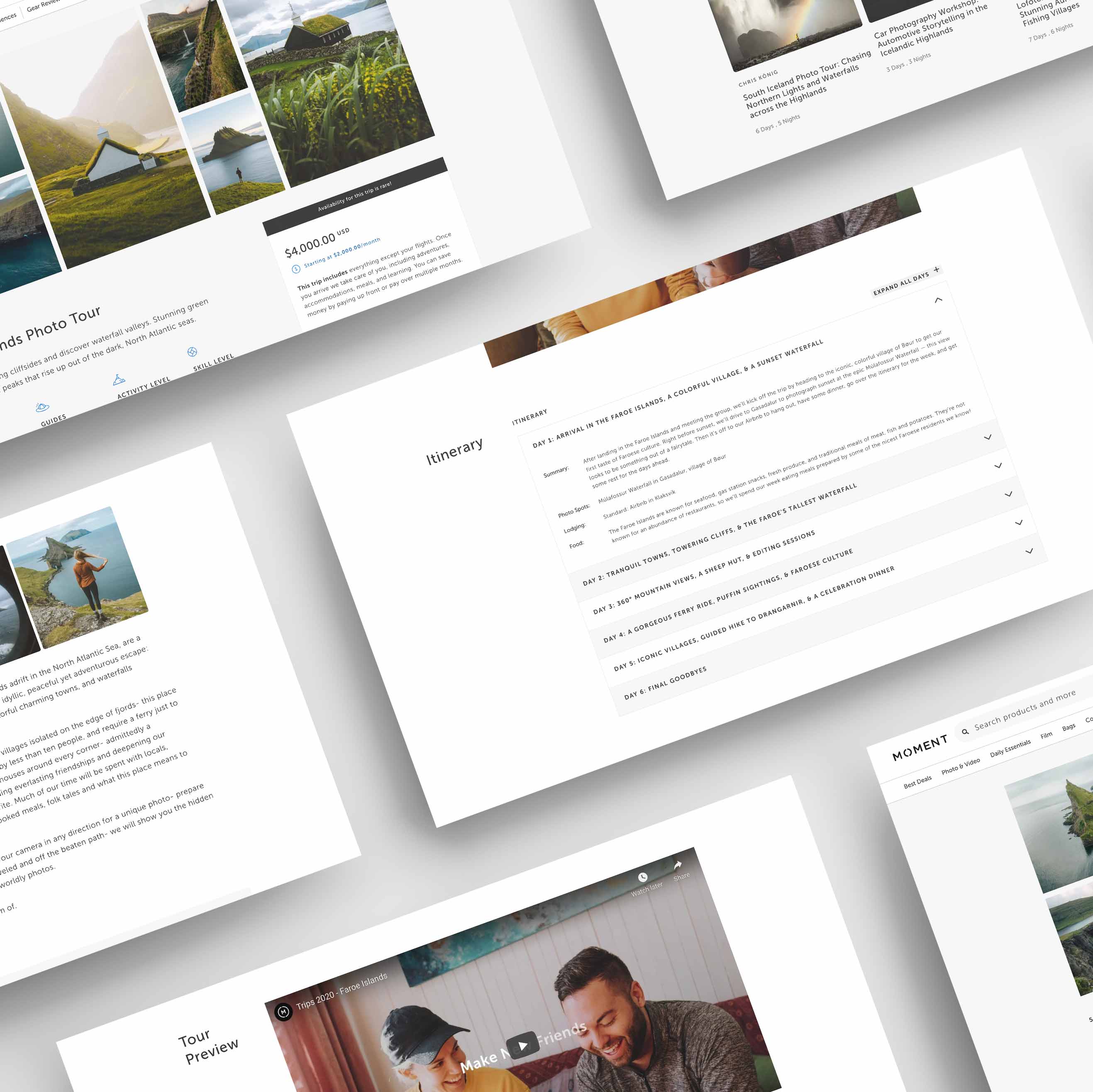
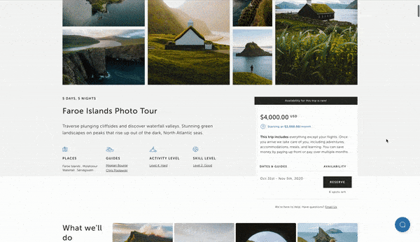
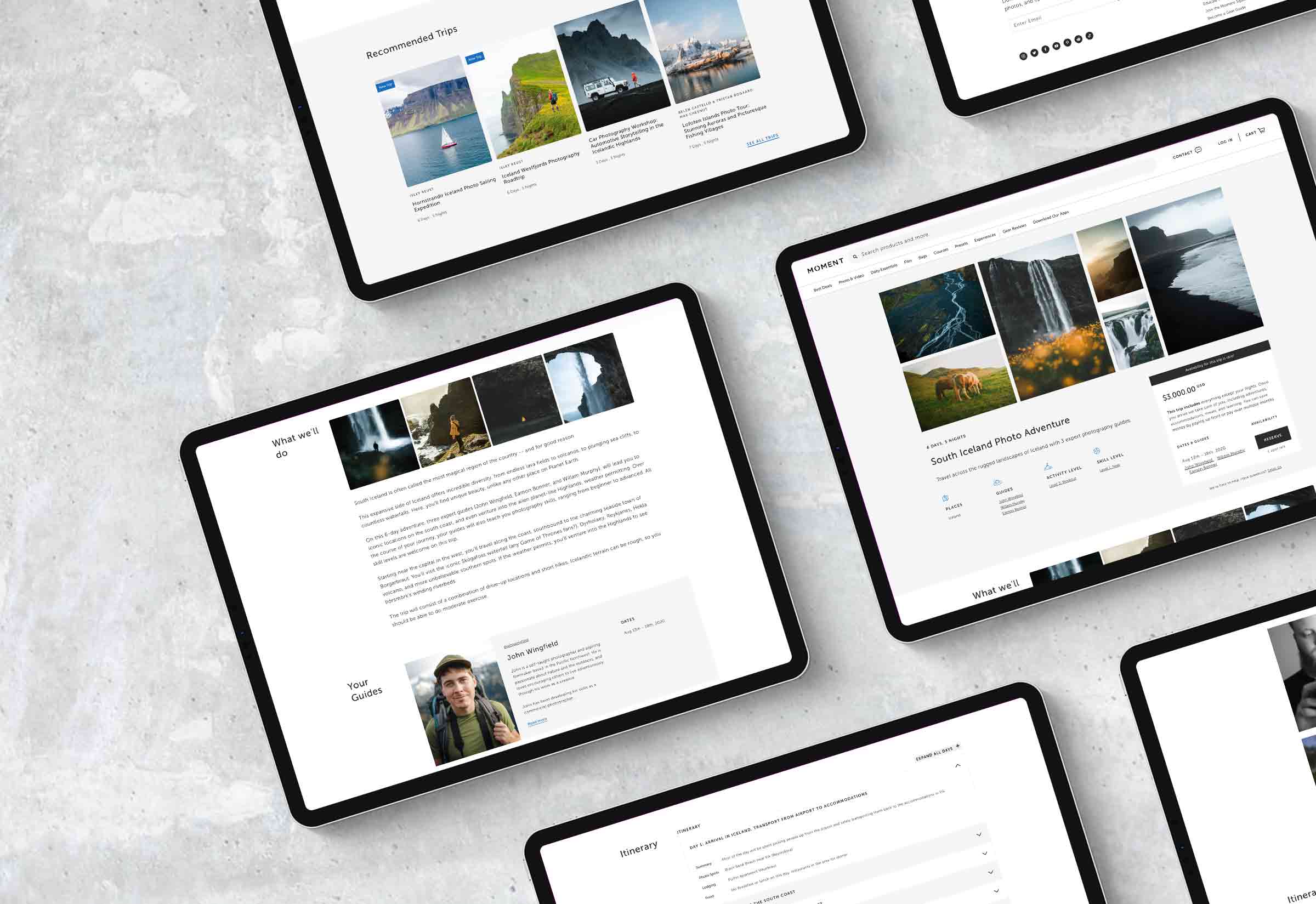
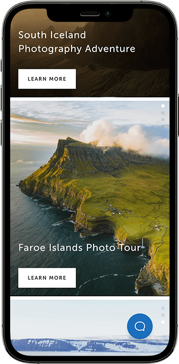
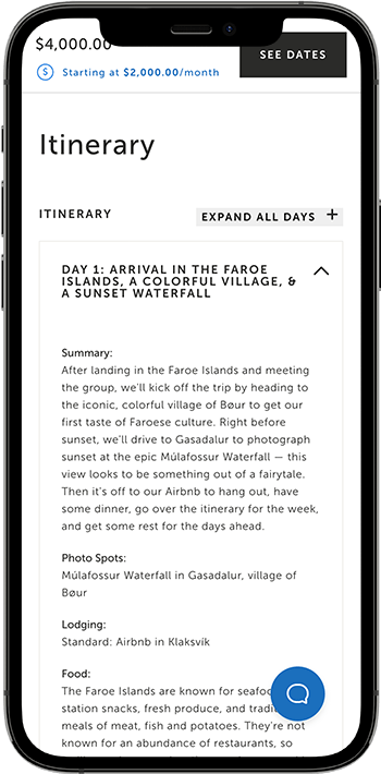
Moment was finding customers want to connect the stunning photos of trip previews with a specific spot, along with a key activity of the day. Our team built off of a concept to make each day become an immersive experience that users can click through and take on one day at a time.
We intentionally limited the number of changes to the original design template, allowing for a quick and easy solution to the problem without much development work.
PHASE TWO
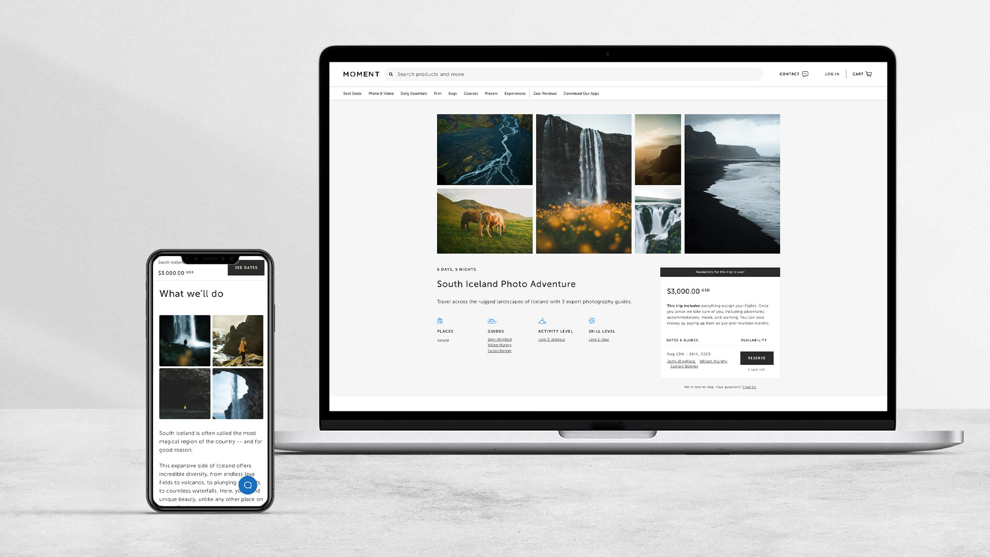
The Moment team and I walked through our directions and chose one to develop further. We discussed a few things to improve and figured out the next steps. We decided to make the hero less of a static image and more of a photo gallery showcase. Two days later I met with the team again and presented the final direction.
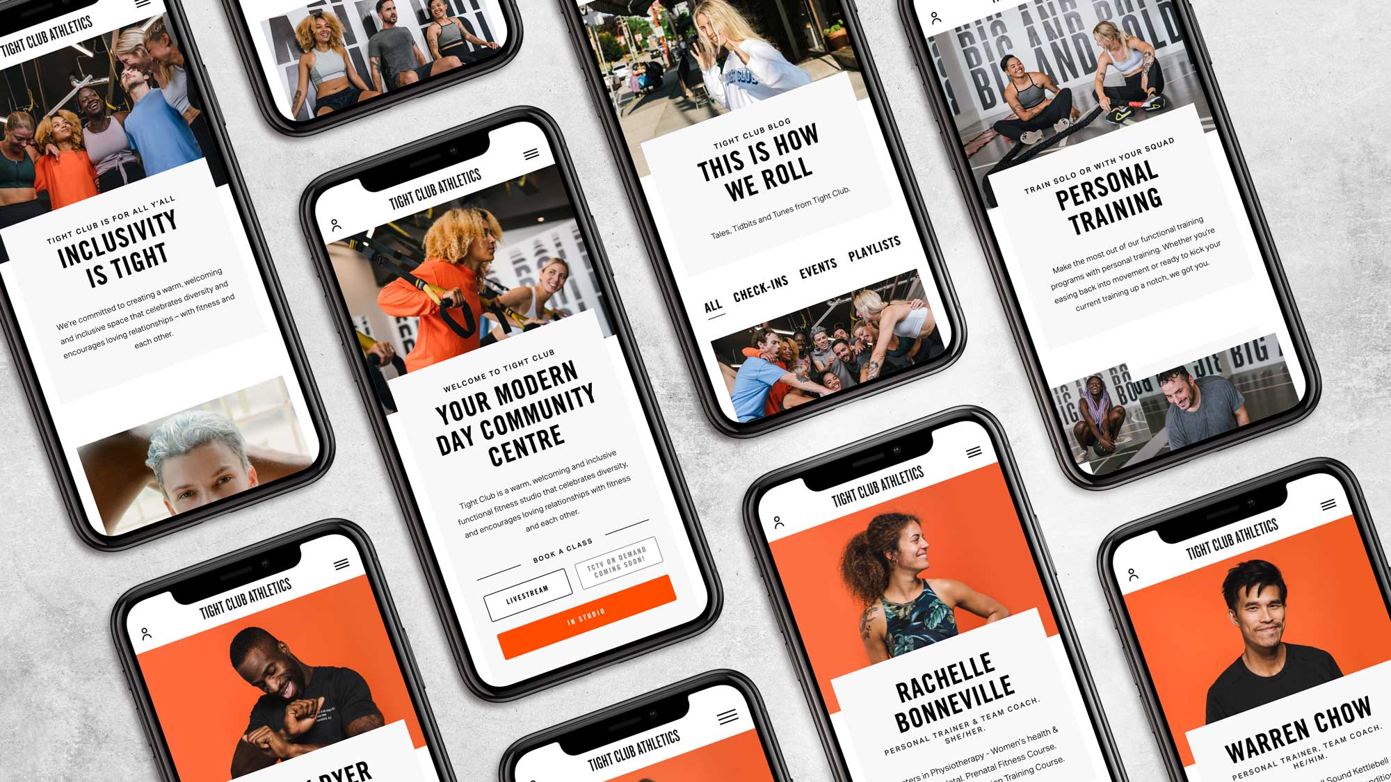
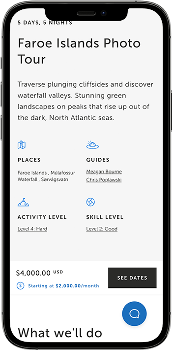
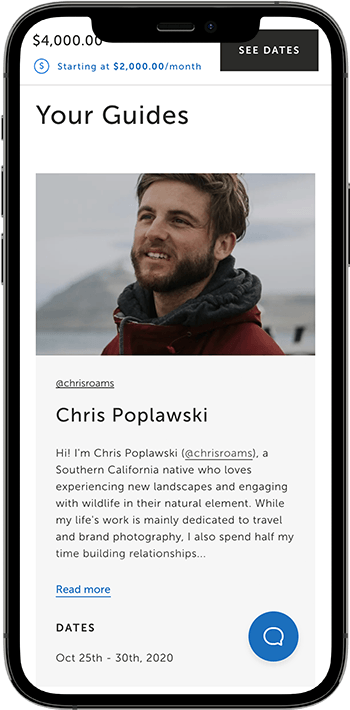
Part of phase two included flushing out all of the mobile designs and really dialing in that experience. I ended up going with a floating CTA along the bottom to prevent the user from needed to scroll for days in order to finally make a purchase. I also cleaned up the “guide section” so that everything was pixel perfect.
THE RESULT
We wanted the website to hook in visitors with beautiful visuals and key activities of the trips. Using a storytelling flow, we built an experience that users can click through and take on one day at a time.
The updated booking experience saw an 18% increase in completed checkouts compared to the initial iteration.
Average time spent viewing an experience increased to over two minutes per visitor, up from less than one minute.
More visitors were signing up from the experience page to receive updates on new trips and exclusive offers.
TOOLS
© WILL GIBSON 2021. ALL RIGHTS RESERVED.